

Introduction
Making Dry Research Intuitive and Actionable
 You have done the rigorous research integrated custom primary and the most relevant secondary research on the topic and the results are truly surprising and your insight on recommended course of action would be a game changer – that is if they understood your findings or worse yet even bother to read it. By leveraging Frame’s information design and data visualization techniques, you can now make your data-filled survey results intuitive and your recommendations and insight actionable.
Business Purpose
Actually Drive the Business Actions Your Report Recommends
What is the impact on your research program if nobody understands or is engaged to even read your research? Our clients leverage the Research Visual Solutions for a variety of business goals:
- Making the Complex Intuitive – While you may pile up pages of explanatory text and tables, it can be challenging for someone new to your research efforts to quickly come to terms with your findings and how you got there. A simple infographic or data visualization can turn on the light
- Engagement – By simply using a clever analogy and a lush visual image on one of your more provocative points, you bring the viewer’s eye in and then their mind as they following your interesting visual narrative.
- Awareness– Emailing or placing it or a written summary on a blog will not do the trick. You need to get them to engage with an engaging visual that tells the research narrative and lets them know your engaging point of view actually exists.
- Learning – By definition your reader is not a subject matter expert but need the results of your research study for their profession and they expect and demand that you take them there – the Frame Research Visual Solution takes them there.
- They Get it Quicker and Remember Longer – Visuals armed with text are proven to increase the rate at which they understand your research as well as the ability to remember its key points. Why would you not want that?
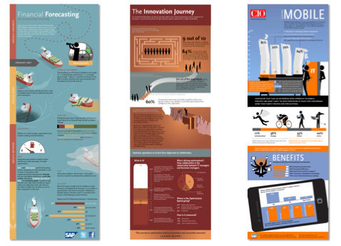
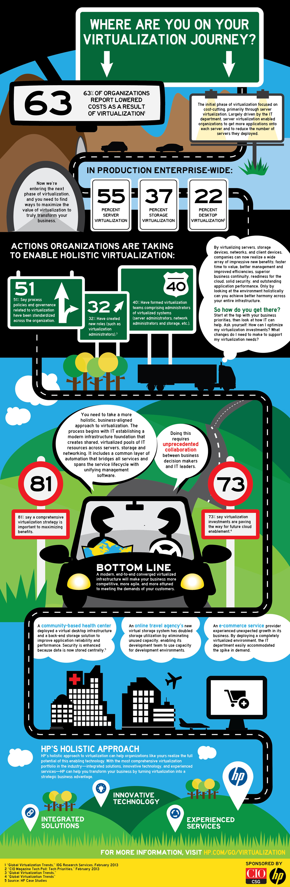
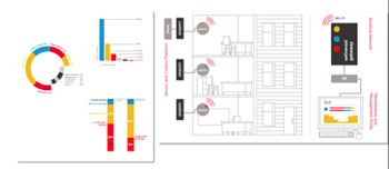
Showcase
More Examples
To see more samples of the Frame Concepts Social Media and Visual Solutions as well as other visual solutions, click here to view a sortable portfolio.